
Introduction
Q-risq is a hurricane weather forecasting company based in Slidell, LA. Q-risq provides hurricane predictions in advance thanks to distributed geospatial analytics engines on big data.
The Business Problem:
The client came with the existed MVP product. They assumed that they have usability workflow issues and UI issues based on their users’ comments, but couldn’t articulate issues clearly.
Before rolling it out to the market, the client wanted to ensure that potential users would be fully satisfied with the use of the app.
The challenge:
Was to communicate poor UX to stakeholders, prioritize the issues, and design solutions in a tight timeline (6 weeks).
The team:
Project manager, UX Strategist, UX/UI Designer – My Role, development team.
The approach
Understand. This phase was about studying the information provided by the client’s business development team.
UX Review. Why UX review? Because the UX review method can help to identify and fix a range of issues in a short period of time.
Design. Suggest a solution.
Understand
Kick-off meeting takeaways
The business objective was to Increase the web-app service area. The client wants to set up the product before the hurricane season in Mississippi state. Assumed audience: 20,000-30,000 signups.
Identify users
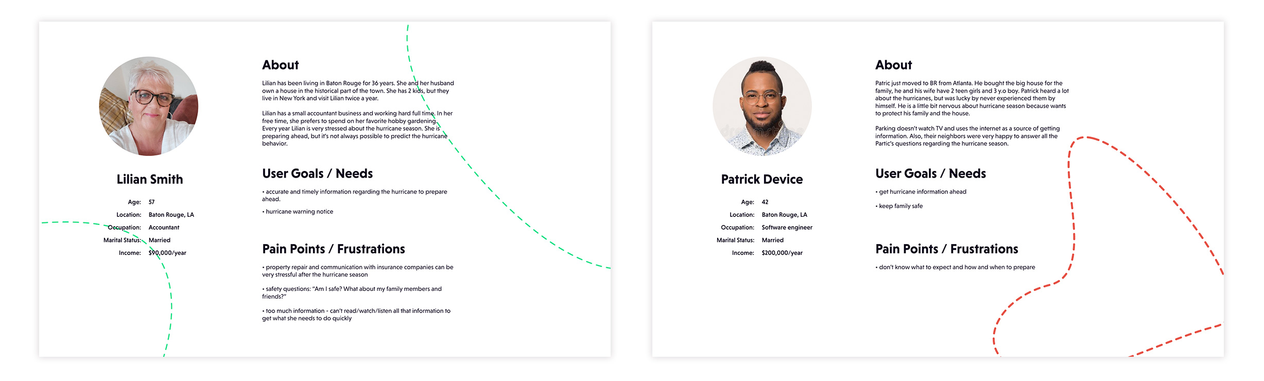
Based on Louisiana’s existing users, I built a hypothesis of user characteristics:
• property owners (homeowners)
• middle and high income
• users age: 35 – 70 y.o.
– geographical location: hurricane-vulnerable states
– the current users are coming from “word of mouth”.
User’s objectives:
• stay safe
• be prepared for the upcoming hurricane (understand weather conditions surrounding their home preferably a couple of days before the storm hits)
• get proof of the hurricane damage done for the insurance company business.
Relied on collected information I built proto-personas (quickly align the client’s existing assumptions about who their users are, but not based on research) and presented to the stakeholders.
Why personas? The client’s team had a substantial technical-scientific experience that influenced their judgment a lot. Presenting a persona helped to dissociate themselves from the users of the product and “humanize” the design process.
UX Review
Get deeper into the product
The purpose of the detailed product discovery (UX Review) was to analyze key user scenarios by examining user flow, content, navigation structure, accessibility and discoverability concerns.
To view the full picture, I took screenshots of all the pages and reproduced the existing user flows in the Miro.
Analyzing the user flows I suggested dividing the work scope into 3 parts:
1. Pre-onboarding – users familiarize themself with the advantages of the product and have the possibility to register.
2. Onboarding – registration and payment process.
3. Web-app – product functionality.
From here the team could:
– decided what actions and features were crucial and beneficial
– prioritized the issues
– created roadmap
– designed the solutions.
Design. The Process.
Pre-onboarding
We consider a marketing website as a pre-onboarding phase. Based on the road map we created in the previous phase “pre-onboarding” had low priority so we left it for later.
However, the website was strategically important from a UX and marketing perspective. During the current phase of the project, we had to connect the marketing website to the web application. Users should have been able to register/log in to the product through the website.
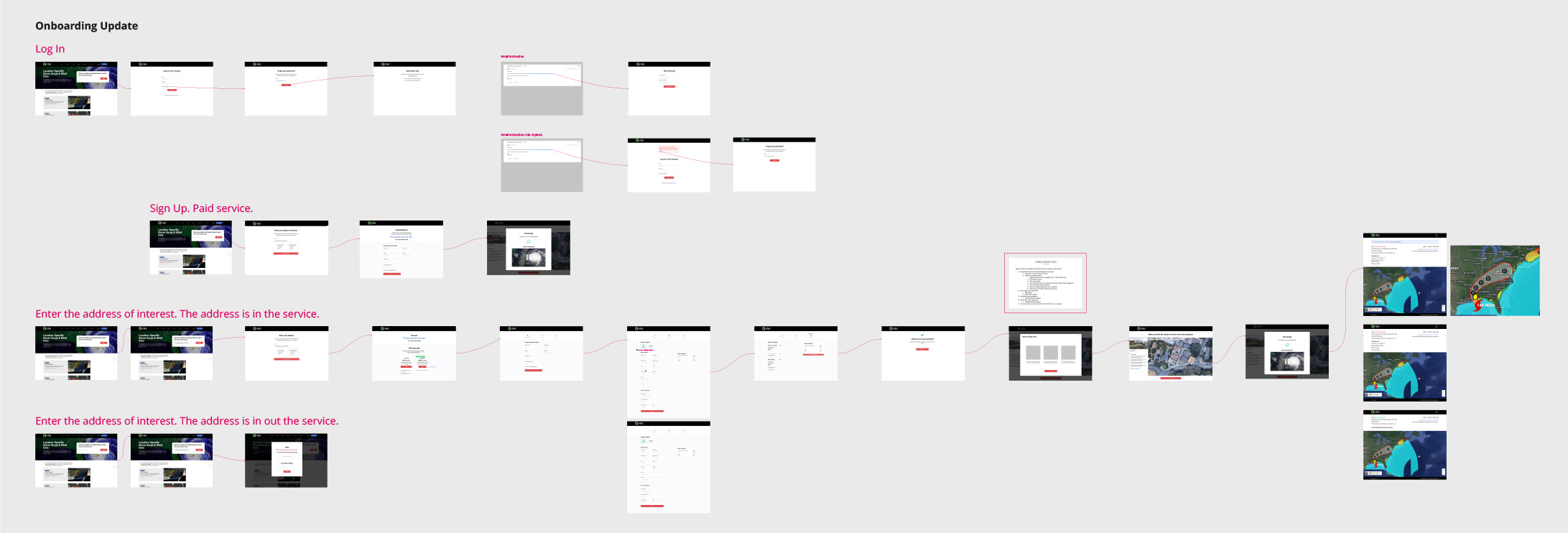
Onboarding
The primary goals of the onboarding:
New users:
• allow users to verify that their property address is in the service area
• show users an intuitive way to register/login to the application.
Existing users:
• have an easy way to log in (Note: In the current version of the product, users had been given a special URL link to login into the application).
To do these, I suggested modifying the navigation on the marketing website and adding an address verification form.
Relying on the UX review findings and the client’s business requirements I brainstormed potentially engaging onboarding scenarios and presented them to the stakeholders. After the client feedback, the prototype was tested and revised according to the new findings.
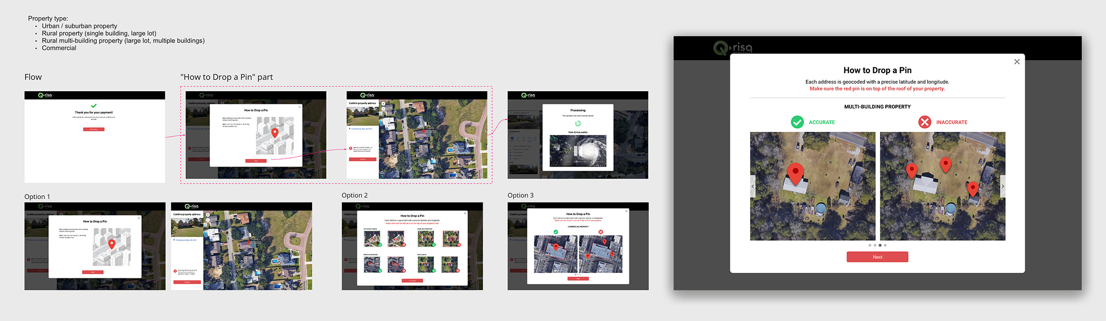
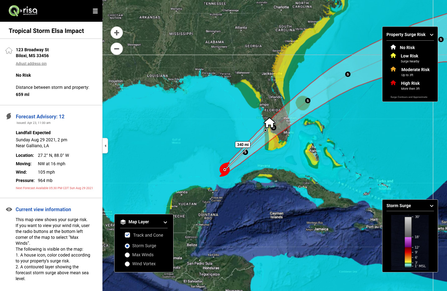
Address confirmation – drop a red pin tutorial
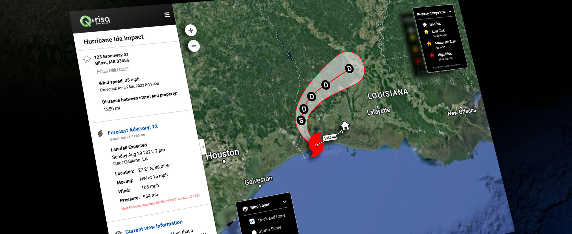
After the registration and payment information, the next important step for the users was the address confirmation.
From a data standpoint, it is essential to lay the pin on the roof of their house, and not on the space next to the houses. 23% of the time Google Maps API (we use Google Maps API for the map) works incorrectly and users struggle to locate the correct address.
I ideated 3 options for the tutorials for different property types. One of them was chosen as optimal.
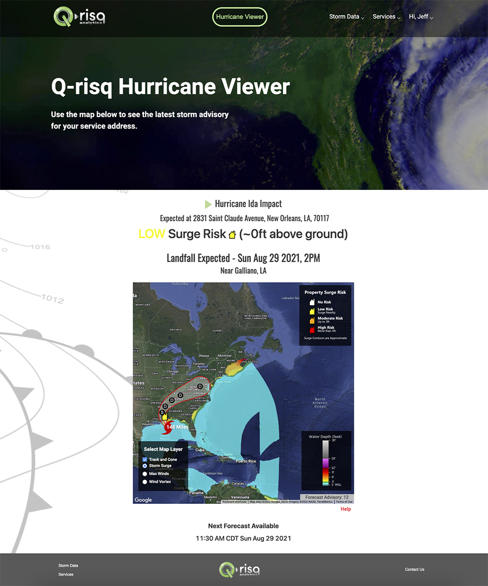
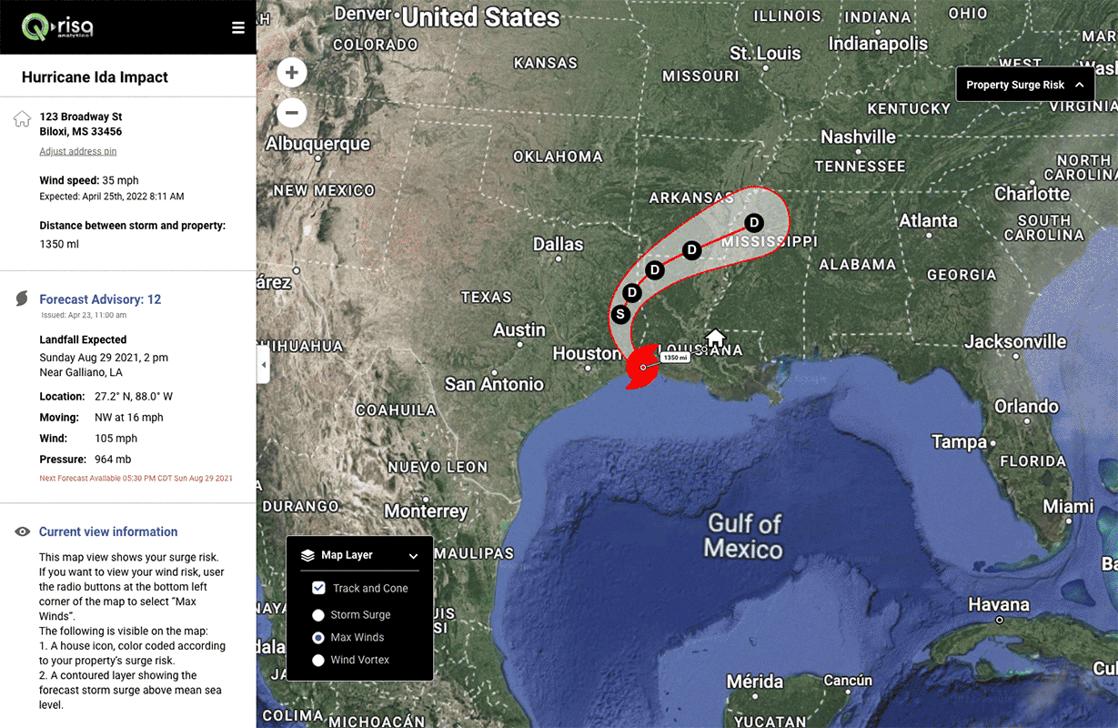
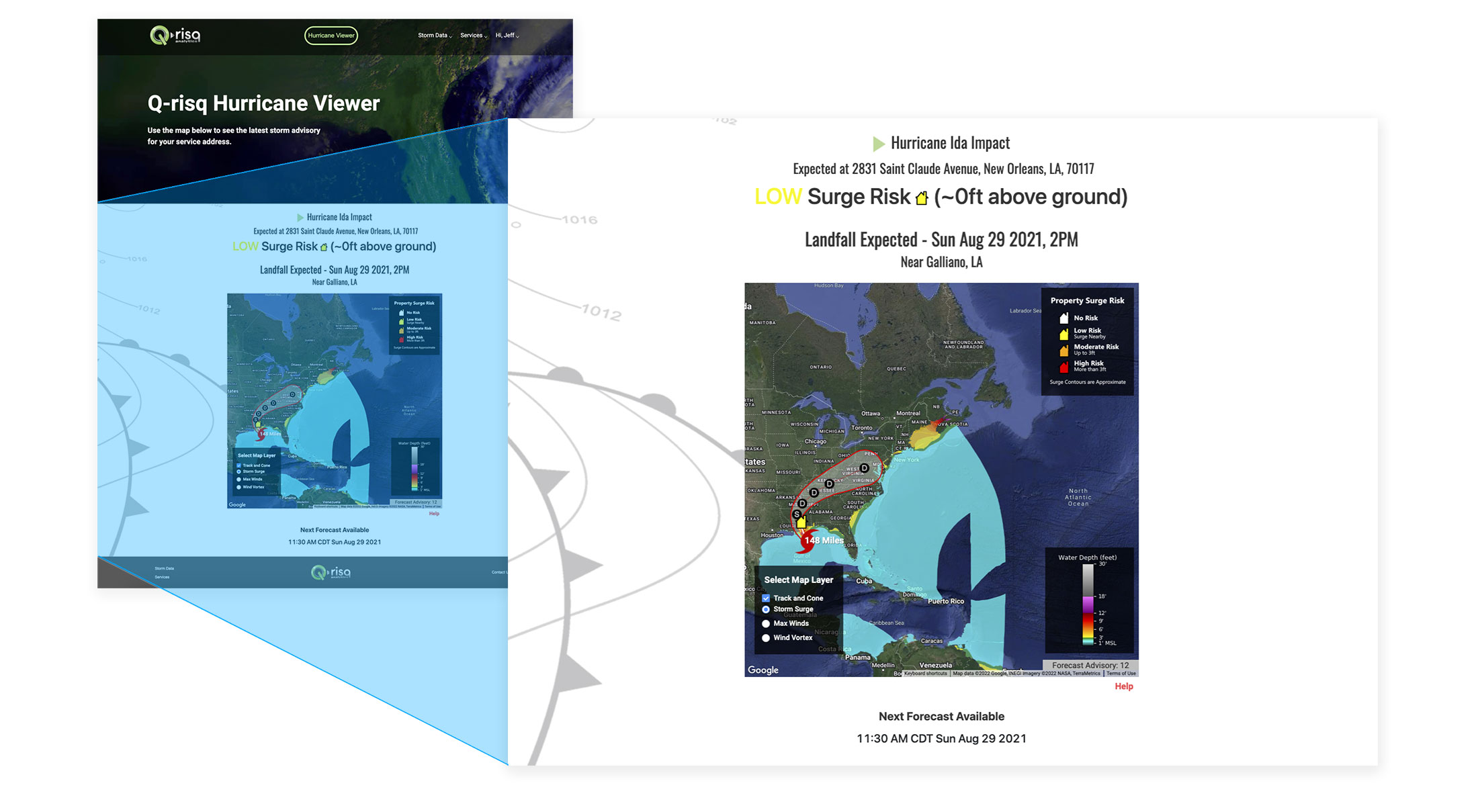
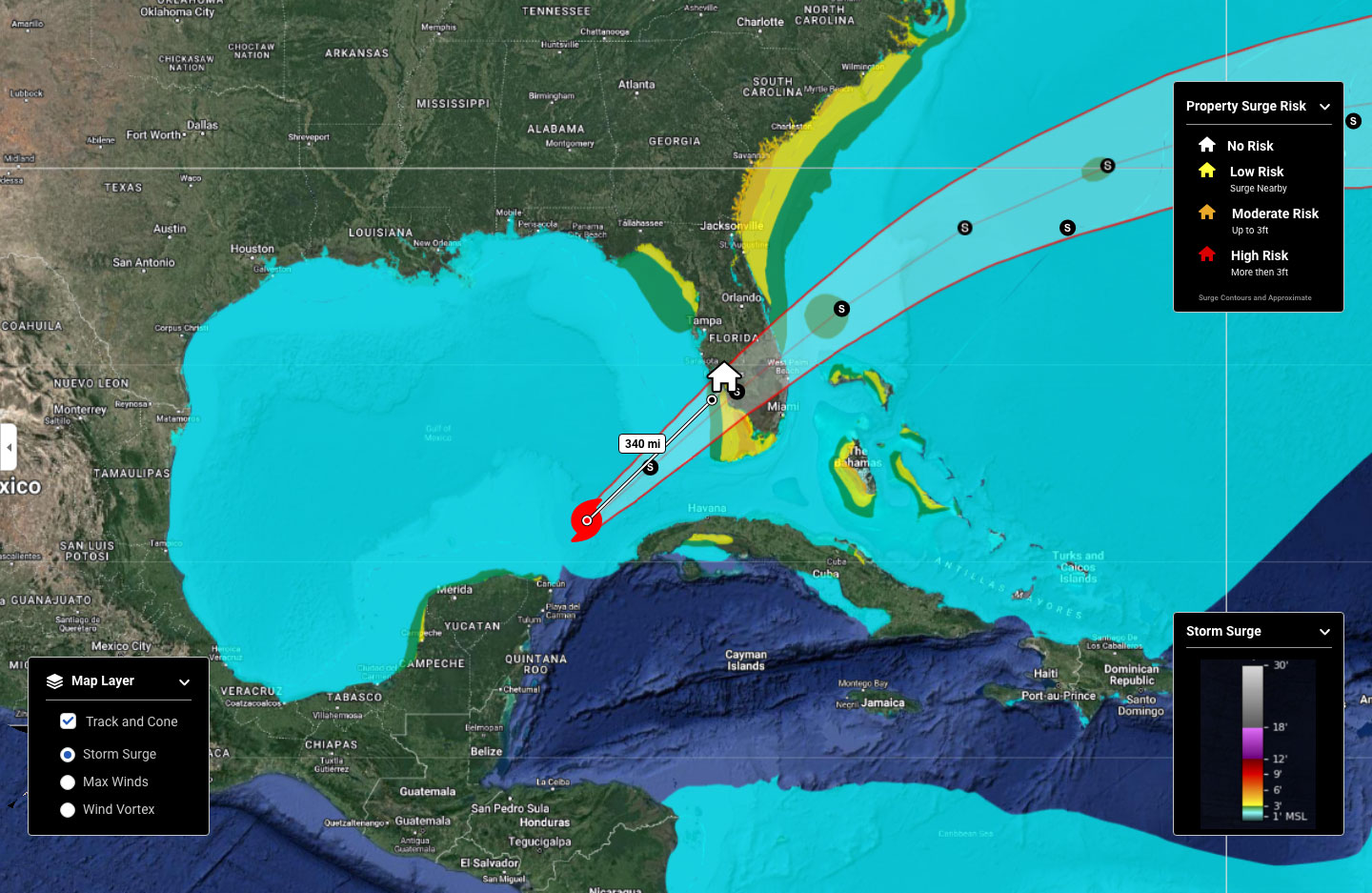
Web-App
All the UX review findings, insights and inputs were collected to the Miro board. It gave us an opportunity to pinpoint every feedback and to collaborate with other team members in real-time.
To solve the issues below I’ve undertaken:
• Executed indirect competitive analysis – to identify existing design patterns. I studied the user flow of all kinds of weather forecast websites to extract common familiar for users design elements.
• Launched a questionnaire – to reinsure that the most helpful information was presented on the screens I surveyed 12 people who have gone through hurricanes before. I asked them questions considering the weather terminology, visual charts, and the prioritization of the information.
• Had 4 sessions with stakeholders to review the findings and potential options of the solutions.
• Performed 2 sessions with the development team to discuss the technical side and restrictions.
PROBLEM 1:
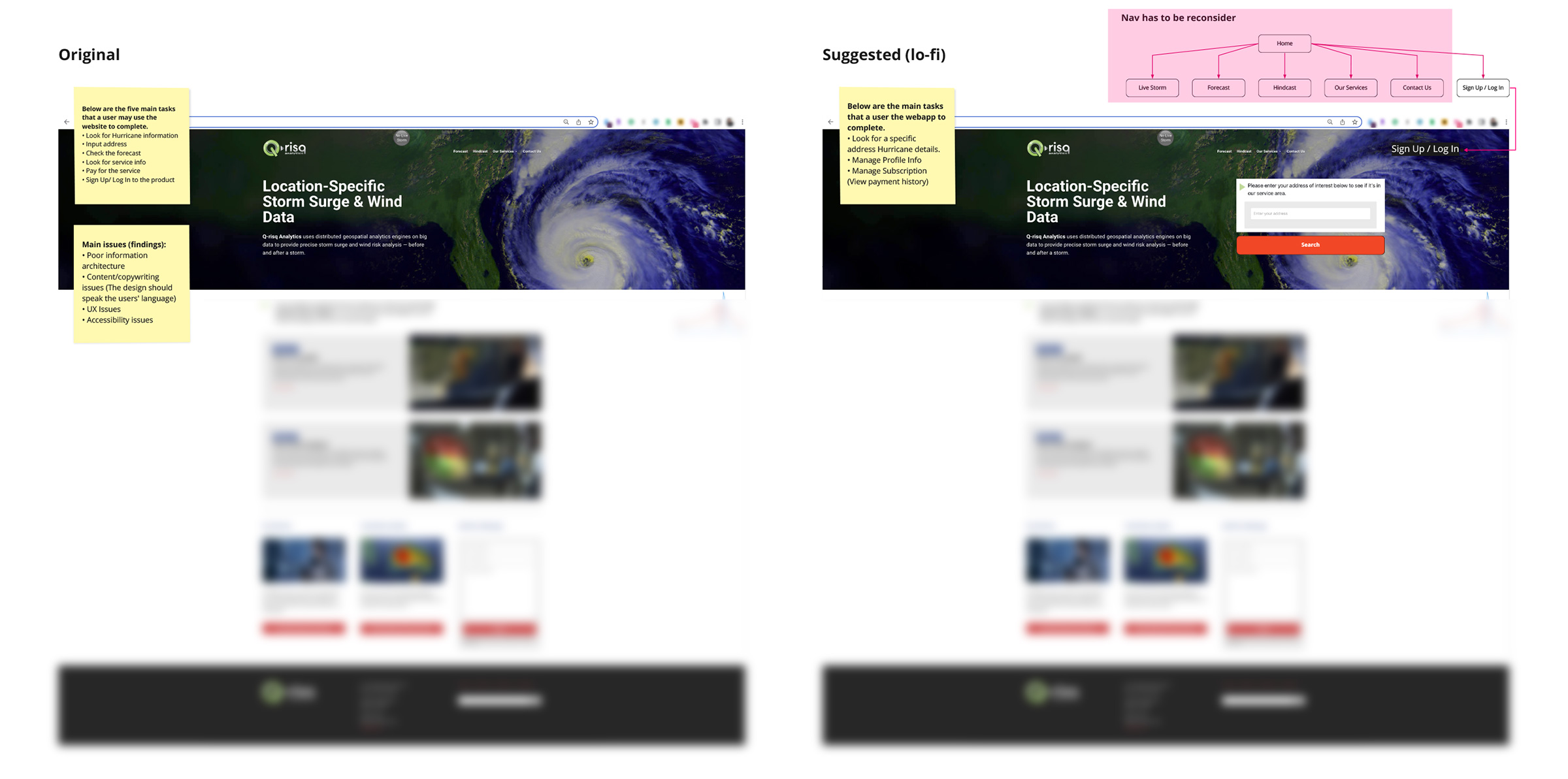
Navigation. The Web-app main navigation is very confusing and ambiguous.
SOLUTION:
Based on the results of the questionnaire I’ve suggested two concepts of navigation improvement and we iterated them with the stakeholders.
Navigation Before
Navigation After
PROBLEM 2:
Structure: Visual clutter & Lack of visual hierarchy makes it difficult to comprehend the information.
PROBLEM 3:
• the style and layout are out of date
• the consistency principle is broken
• the layout didn’t look like the weather website which in turn led to familiarity issues
• color contrast accessibility issues.
ONE SOLUTION:
Relying on the competitive analysis and following the principle of consistency I rethought the layout and organized the information in a more structured and complete manner.
I also suggested including:
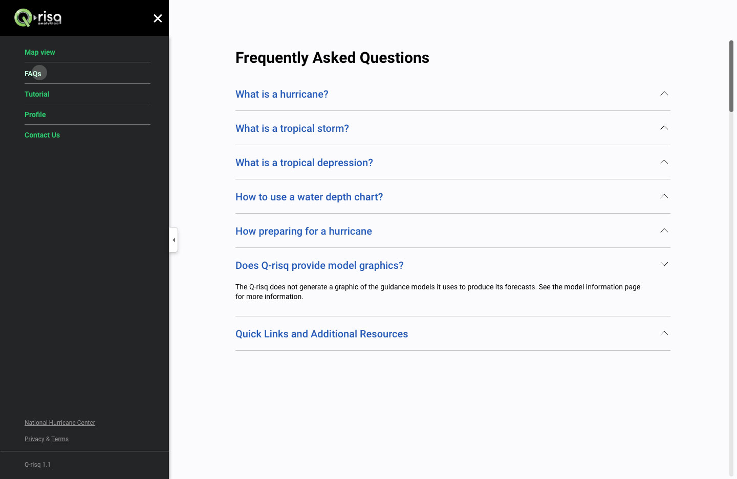
– FAQ page to explain all the terminology (34% of the interviewees were confused about terminology)
– Tutorial page to explain how to read/use the web-app functionality (25% of interviewees were unclear about filtering and how to measure the distance).
Before
After
After
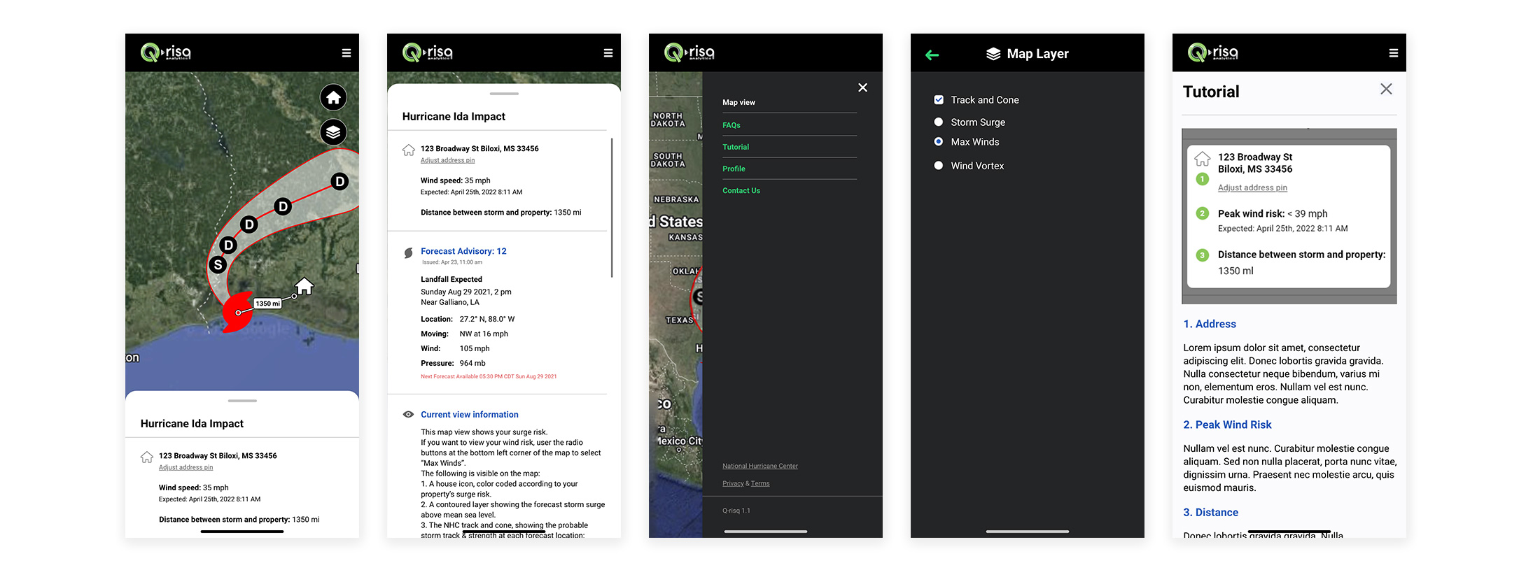
Mobile concept
The product mobile version is the next crucial step for Q-risk.
For this phase, we have introduced a responsive design concept to stakeholders team. They have requested it to get an idea of what it might look like.
Final Result
I finished this project by exporting the final designs and the UI pattern library to Zeplin.
These designs contained all the screens for the features we had been working on, including different states and edge cases.
Thanks to our close collaboration with the stakeholder’s team the solutions were hands-off in time to the developers.
The next steps should be usability testing and iteration.