
BRIEF
MOSTe is a community-based mentoring, scholarship, and college-access organization that encourages young women’s education and success.
THE CHALLENGE
At first, a client came with the request for a website UX audit.
Objectives for the UX website audit were:
• Identify UX issues
• Identify the web site opportunities
• Discuss UX improvements
KEY DELIVERABLES
• UX strategy improvements & recommendations
• Website prototype
___________
2020
MY ROLE
UX/UI Designer (Researcher, UX Designer, Interaction Designer, Visual Designer), collaboration with a web developer.
DURATION
3 month
TOOLS
• Google Analytics
• Miro
• Whimsical
• Figma
• Notion
THE PROCESS
1. UX Audit
1.1 Understand business objectives – the client interview
1.2 Get to know the users
–– 1.2.1 User survey
–– 1.2.2 User persona
1.3 User Flow
1.4 Review analytics
1.5 Heuristic evaluation
2. Compile findings & recommendations
2.1 Sitemap
2.2 Wireframes
2.3 UI Design
2.4 What was Done to meet business goals
3. Next steps
UX AUDIT
1.1. UNDERSTAND BUSINESS OBJECTIVES – CLIENT INTERVIEW
The goal of the interview was to come out with a set of business objectives for the website (what the client wants to see improved) and to understand the organization’s’ goals.
I have prepared a list of questions about the organization and the website and asked stakeholders to answer them.
The business objectives (from the client interview session):
1. More mentor signups
2. More signups for a newsletter
3. More traffic to the website
1.2 GET TO KNOW THE USERS
I already had some information about the website users from the client perspective. My next step was to know more about them.
1.2.1 User survey
2 user surveys were conducted:
• the first respondent’s group is MOSTe programs’ participants. (The assessment had include questionary about the application process.)
• the second group is website visitors.
The surveys provided insights into the respondents’ website interaction, motivation, and opinions about the experience.
User surveys findings:
• Users wanted to see updated information.
• Returning users are looking for info about upcoming programs and activities.
• Users want to know about the organization’s impact (number, pictures, articles).
• Successful stories are very inspired.
• Most of the program participants consider the application process as “easy and convenient”.
• Most of the users didn’t know about the option “sign up to newsletters” via the website.
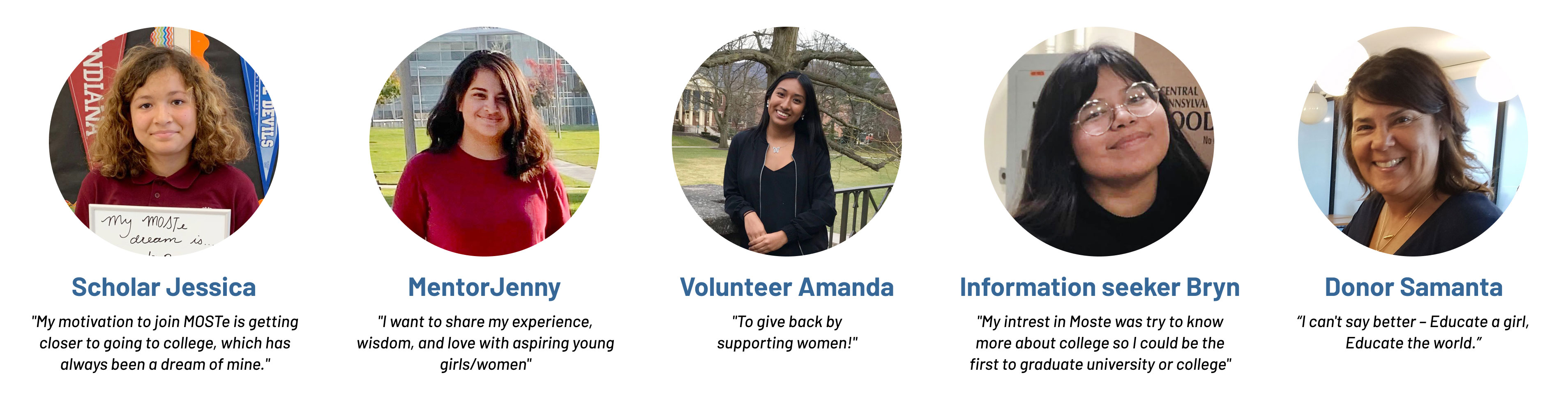
1.2.2 USER PERSONA
This is done by creating fictional user personas (via stakeholder interviews and users survey).
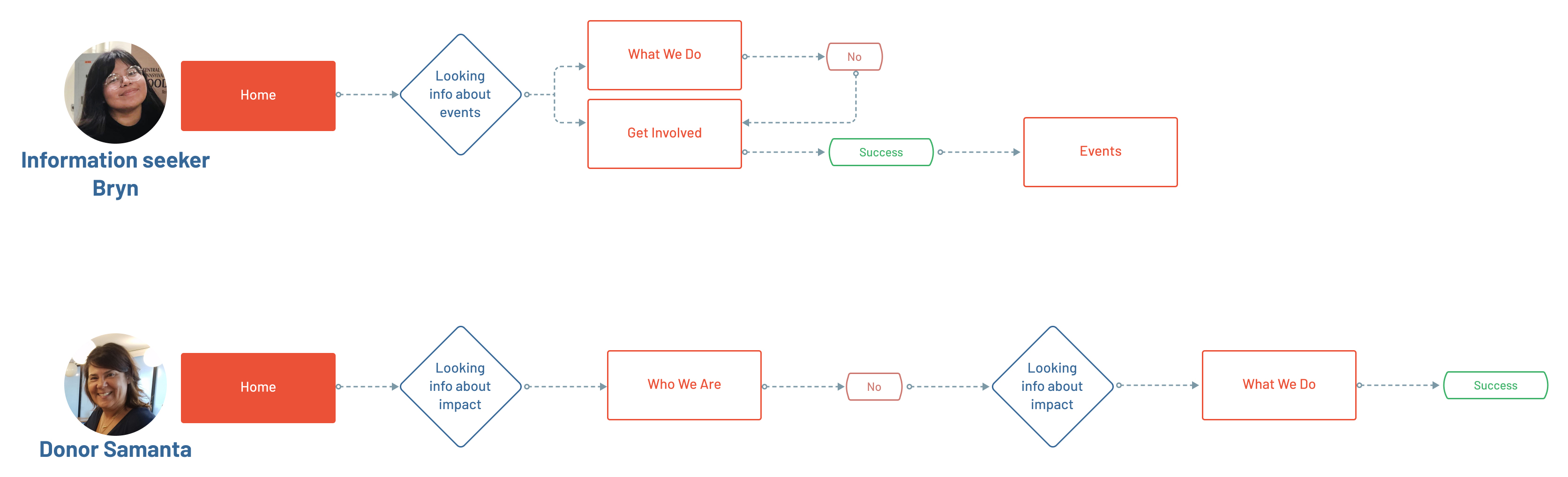
1.3 USER FlOW
The user insights gleaned from getting to know users turned into user flows.
This process should also identify where the user might encounter difficulties or head down the wrong path.
I created a potential mentor users flow based on the business objectives requests:
• Mentor signups. The user’s need is to apply to become the mentor, the business objective is to engage potential mentors.
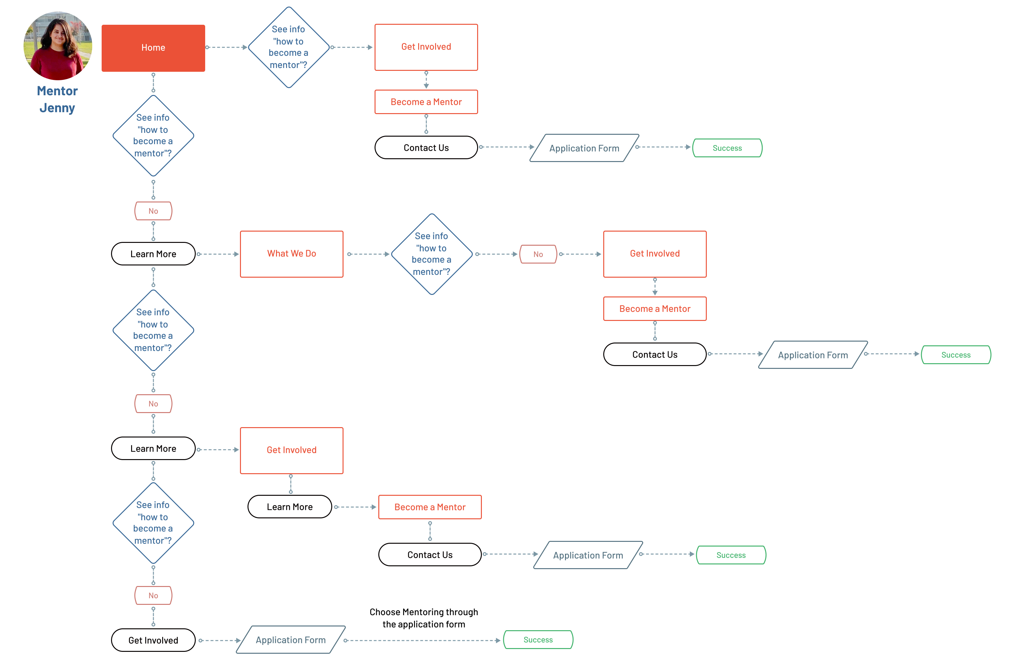
• More signups for the newsletter. The user’s need is to find Newsletter sign-up form; the business objective is to engage users to sign up for the newsletter.
The users could sign up for the Newsletter thought any website page because the sign-up form is included in the website footer. But most of the uses didn’t see the form considering “it’s a part of the footer menu”.
• More traffic. The user’s need is to get updated information about requirements, upcoming events, organizations’ impacts; the business objective is to engage the user in the website activity.
1.4 REVIEW ANALYTICS
To find out how the product was used over time (3 month period) I turned to Google Analytics.
My goal was to see indisputable, quantitative data about who’s interacting with the website and what they’re doing while they’re there.
Main findings:
• 87,7 % of the total users are new Visitors and the Average session duration is 2.01min (Bounce Rate is 61.15%).
• 34.90% of new visitors are from the Organic Search (Bounce rate 48.32%) and only 3.47% are from Social media (Bounce rate 76.74%).
• 70.74% of the users entered through the Home page (Bounce rate 56.41%).
• The most user’s attention received Home page (starting page for 76% for new users), Who We Are, What We Do.
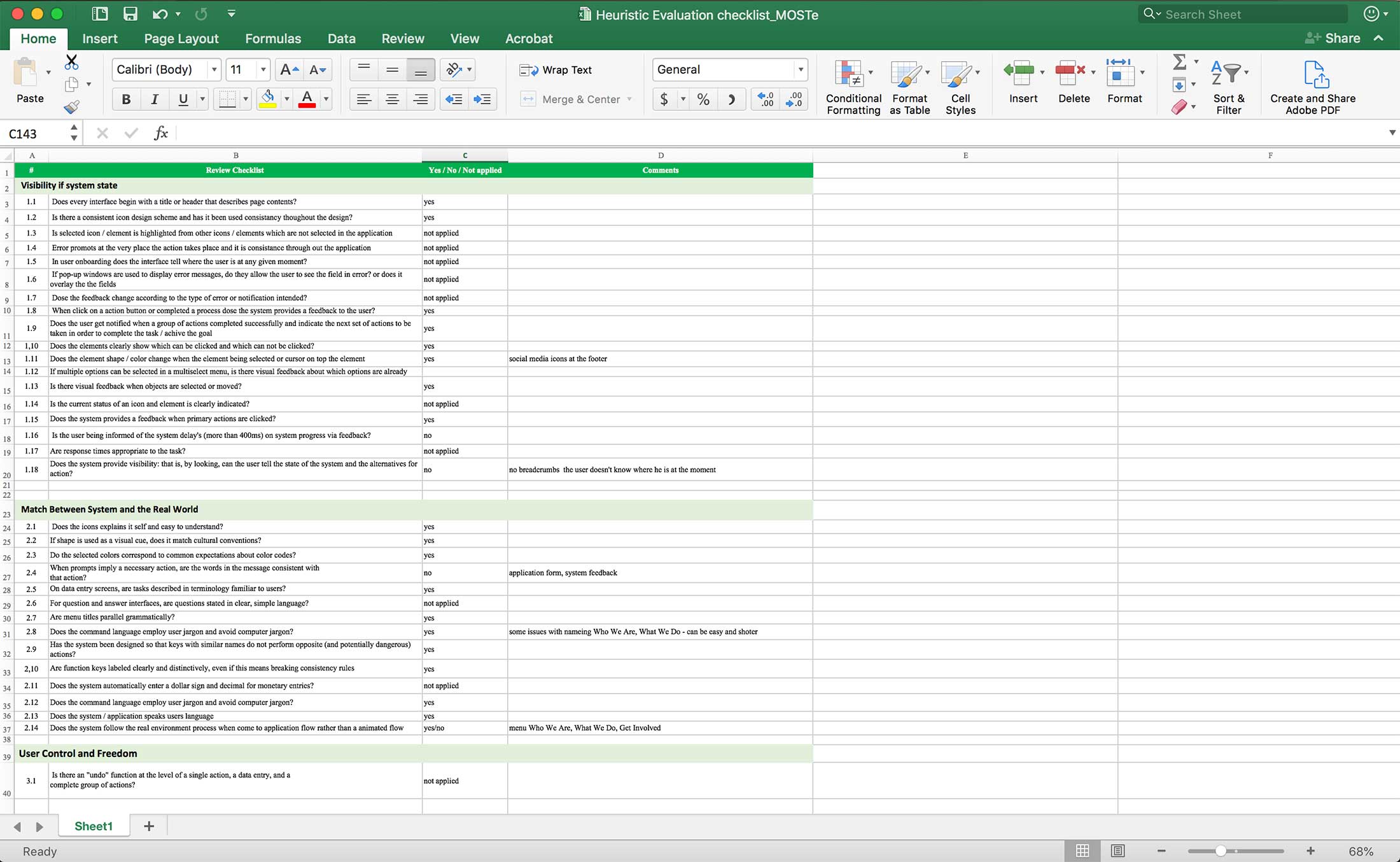
1.5 HEURISTIC EVALUATION
At this stage, I took what I’ve learned from creating user personas and gaining insight into user objectives to go through the product as if I’m the user.
I base this process on established Jakob Nielsen’s 10 usability heuristics.
COMPILE FINDINGS & RECOMMENDATIONS
2.1 SITEMAP
The main usability issues were Navigation & Information Architecture:
• There is not a convenient and obvious way to move between related pages.
• Some pages of the website use contextual navigation (Who We Are, What We Do) others use main navigation and local navigation which is very confusing for users.
• The important information that users are most likely to need is not easy to navigate to from most pages (Activity page was hidden).
• Navigation choices are not ordered in the most logical or task-oriented manner.
• Navigation category labels inaccurately describe the information in the category (Login page).
To fix the navigation issues and to observe the whole picture I have built the website map.
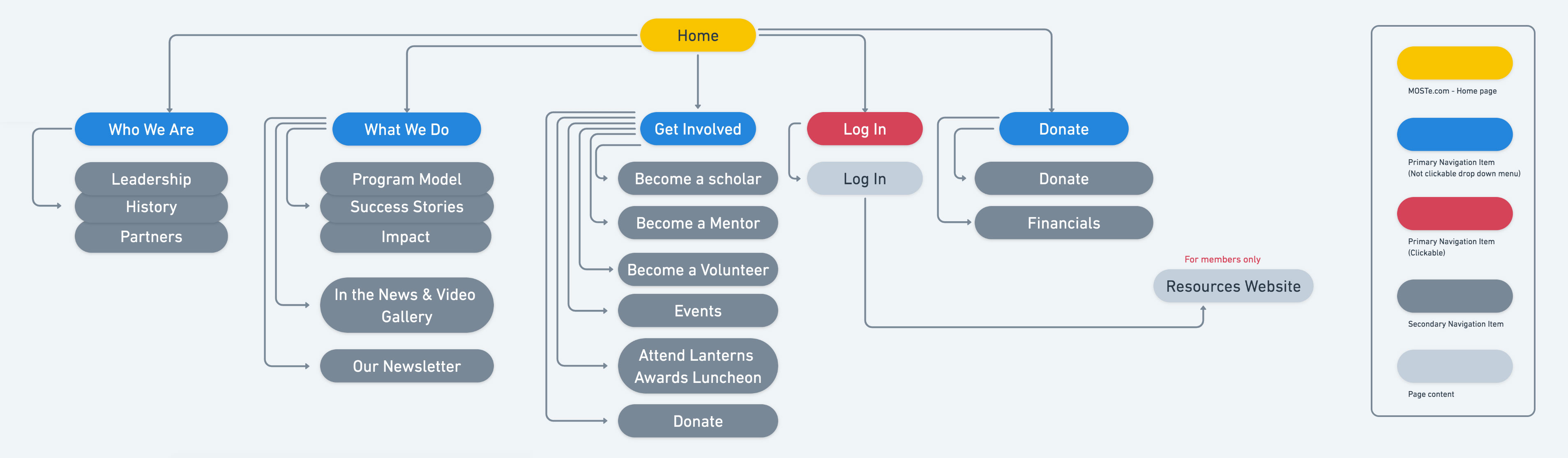
Information architecture an old version
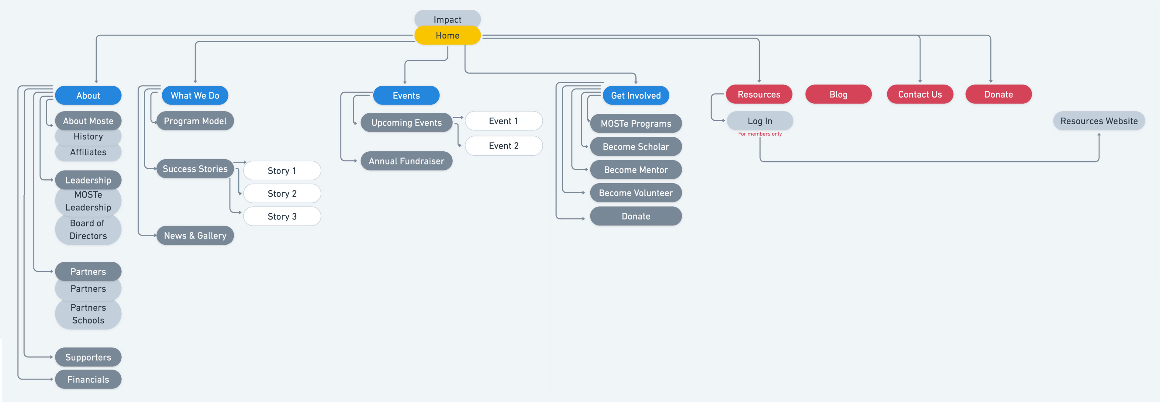
Information architecture a new version
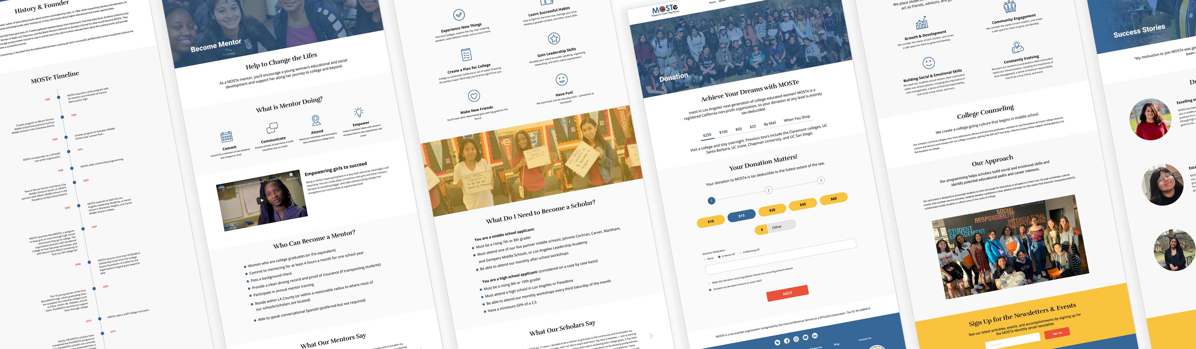
2.2 WIREFRAMES
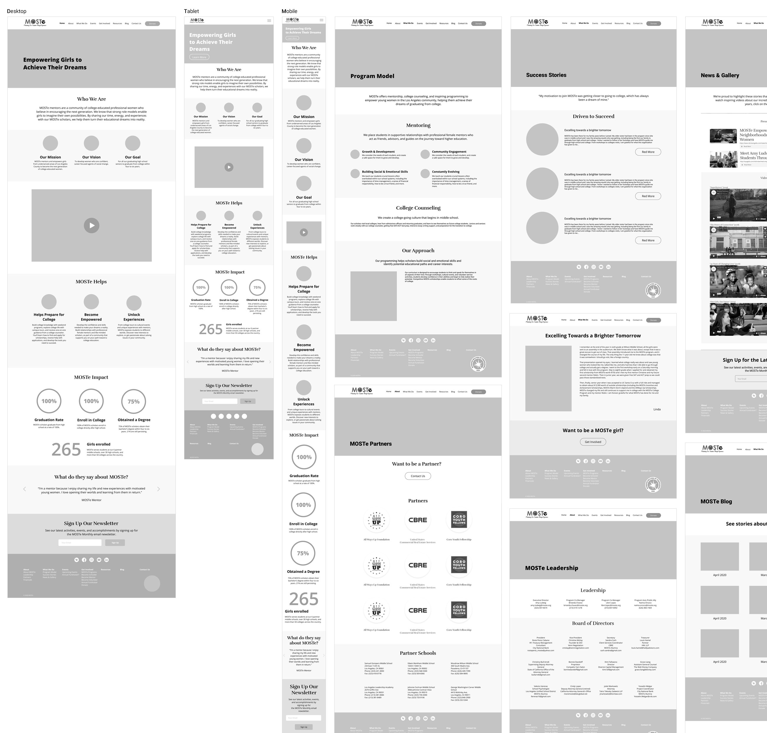
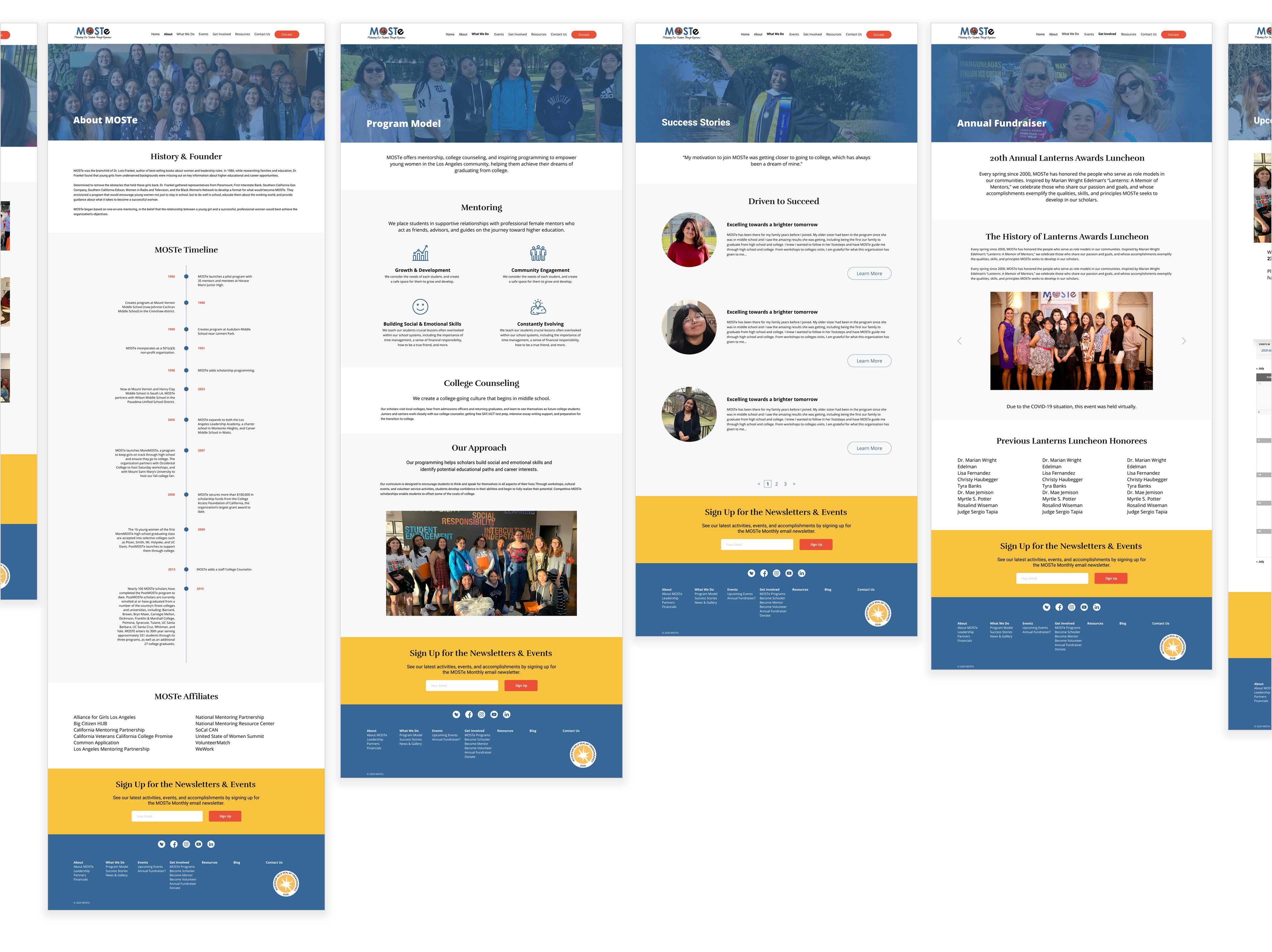
Next, taking into consideration the research findings and business goals I created the website wireframes and additional responsive wireframes for the Home page.
2.3 UI DESIGN
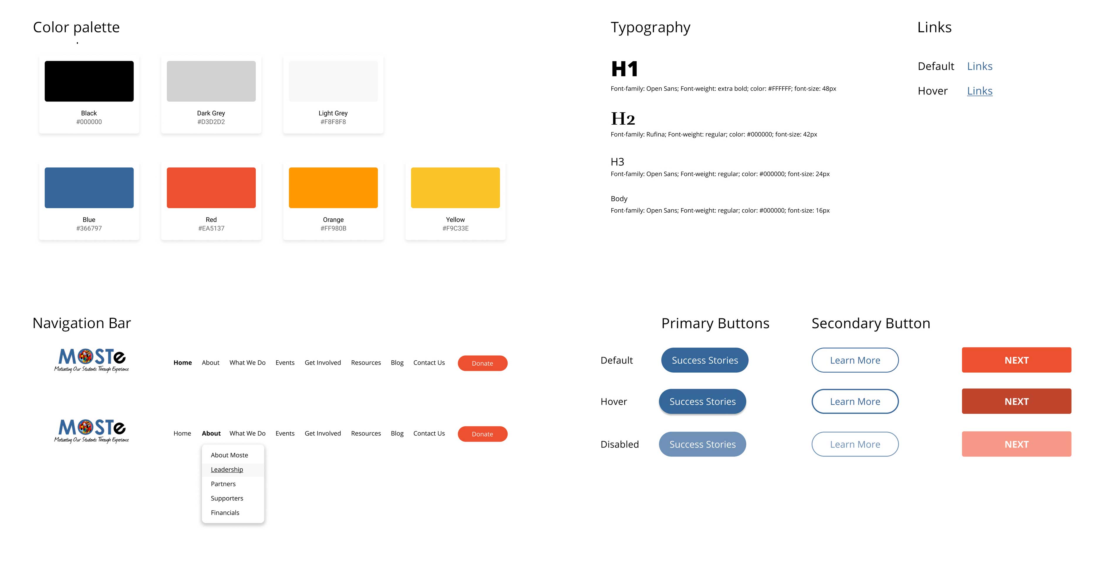
I followed MOSTe style guide.
UI Kit
2.4 WHAT WAS DONE TO MEET BUSINESS GOALS
• Redesigned web site structure.
The new website navigation structure will help users to move smoothly and without confusion thorough the website.
• Rebuilt the Home page to provide the website visitors with information about the organization’s impact. It will help the organization to enhance trust and authority in the visitor’s eyes (It was made based on secondary research findings). Also, I included an engaging banner block with a prominent slogan and a CTA button for potential mentors.
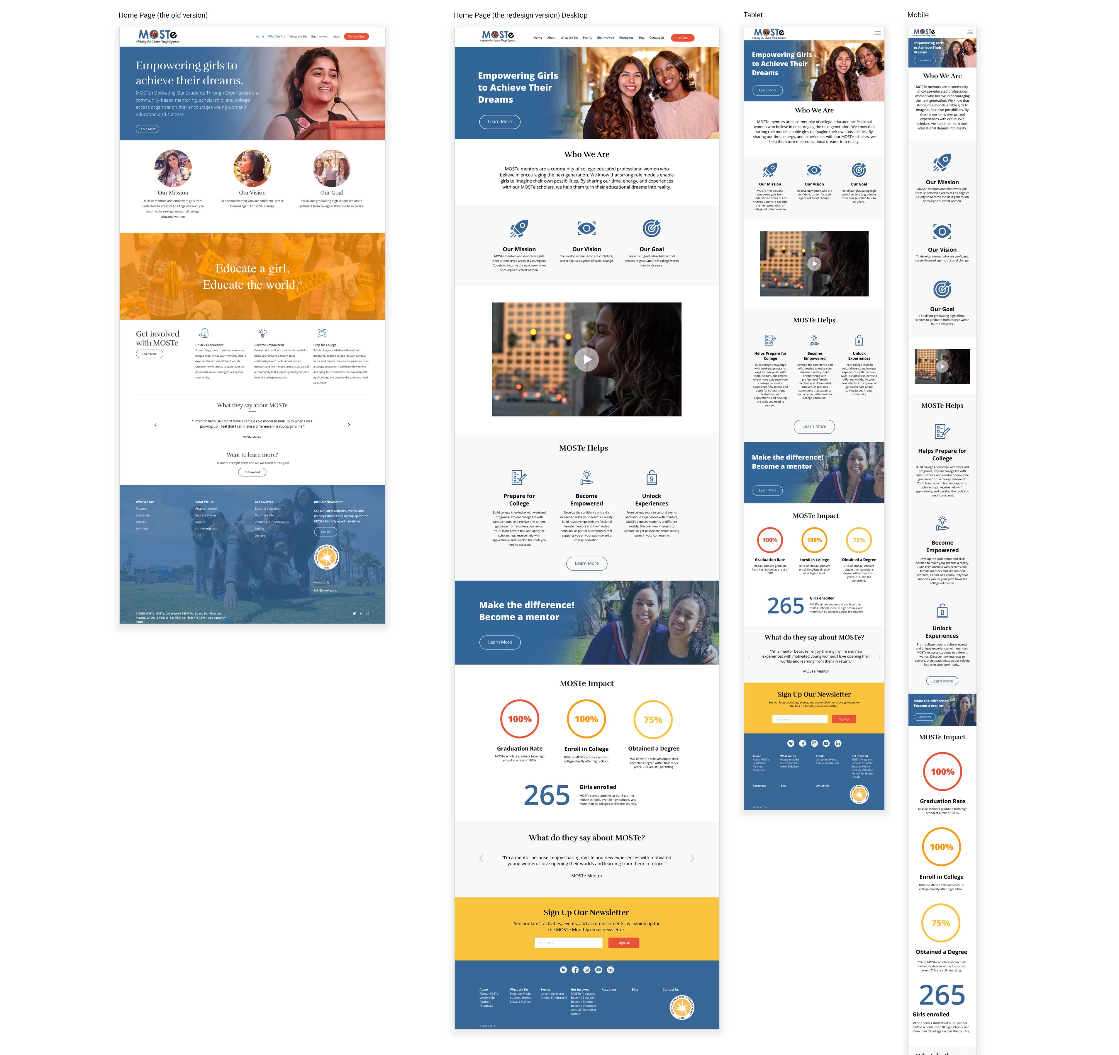
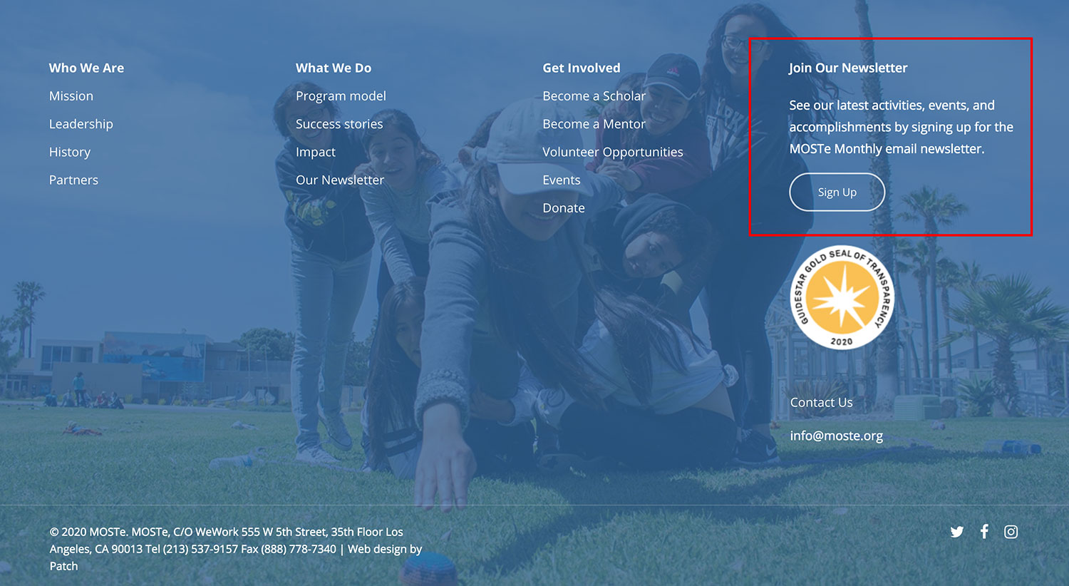
• I higlited visually and placed the Sign Up form in a prominent place on the landing page and on the strategically important pages to engage more users to sign up.
NEXT STEPS
For the next steps, I would test the updated version of the website and iteratively improve the design.
Also, I would recommend conducting content audits and working with SEO specialists to inherence organic traffic to the website.